
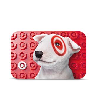
When you’re looking at an advertisement, what are the first few things you notice? A good advertisement will strike your interest, usually by a logo or tagline. An excellent advertisement is recognizable and memorable. It draws our attention and we instantly relate the logo to said product or company. A perfect example is that of the following logos. Can you name these brands?
![]()

![]()
McDonald’s and Facebook both utilize a simple letter in their logos. Starbucks is one the most recognized brands in the country from their famous siren. Target uses the iconic target symbol, and even tends to plaster their cute mascot on everything! One of the most noticeable things about each logo, though, is their color scheme. After all, when my four-year-old gets hungry on a road trip, I tell her to look for “the golden arches” – and she notices them every time.
The first thing that we experience in anything is the visual aspect. In other words, characteristics such as fonts, symbols, and colors are the first things that we notice. Color sets a mood; studies have even shown that painting the walls of a student’s bedroom can help influence how well they study. So it’s no wonder that the color of your advertising can have such a huge impact on whether or not a prospective customer will use your product or service. In fact, there is an entire field of research devoted to “color psychology.” It’s basically a bunch of people who sat around and figured out how color affects a person’s emotions, including things such as impulse control, how long a person will browse in a store, and triggers of hunger. Check out this chart for a simple way to see how colors can affect an individual’s purchasing decisions.
Color gives power to an advertisement, giving subtle suggestions to customers. Red portrays energy and quickly catches the eye. Blue displays emotion and connection. Green typically represents an eco-friendly product or company. By focusing on what your company stands for and the ideas that it wants to exude, you can choose the best colors to use in your marketing.
Simple is usually best. If you want to project professionalism while letting clients know that you’re still a driven company, a sleek product with a pop of color may be the best way for you to go.
Figure out what works best for you. Discover the vibe of your company, utilize your resources, and draw in your customers. Do this and you will always make an impression!